The WinRT XAML SDK holds a big secret. It’s even a secret why it’s a secret. But you’ll see several of forum posts with Microsoft staff hinting at this secret, but not following up with actual examples or sufficient documentation.
So what is this secret? Well let’s start with good old WPF, Silverlight and what else is dead. One of the issues with these frameworks has been performance, and one of the performance issues was converting XAML into running code at runtime. This requires a lot of reflection and was part of the performance problem. WinRT attempts to solve this by taking this hit during compile time. It basically generates metadata about the classes you use, and thereby avoids the reflection overhead. At first glance this is pretty clever but as I’ll show later can also have some major issues that require a lot of code using hardly documented interfaces to resolve.
This is my attempt to decode some of these interfaces. I’m not fully understanding all the bits myself yet, so this blogpost is partly to share what I found, but also my process for better understanding it.
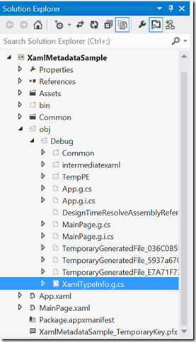
So back to the big secret: IXamlMetadataProvider. This is the main interface that drives this type resolving at runtime, and for the most part this is done for you, and this is also where our journey will start, because we can take a peek at that work. Open any of your Windows Store XAML apps projects, turn on the “show all files”, and open up the secret \obj\[Config]\XamlTypeInfo.g.cs file.

The code will look something like this in the top:

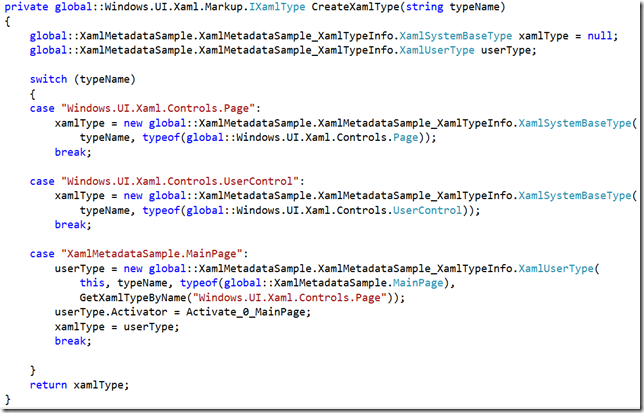
Keep scrolling a bit down, and you’ll start seeing some string-based typename lookups, including the types you use in your app:

Now let’s try and create a new class and see what happens to this file. Let’s add the following class:
public class StringCollection : ObservableCollection<string> { }
Rebuild, and check the auto generated file. You’ll notice that this class does not show up. This is because it’s not used in XAML or by anything else that is used in XAML. Next try declaring this collection as a resource in XAML:
<Grid.Resources>
<local:StringCollection x:Key="coll" />
</Grid.Resources>
Let’s jump back and look at the CreateXamlType method that magically just got updated with a whole lot of more code:
private Windows.UI.Xaml.Markup.IXamlType CreateXamlType(string typeName)
{
    XamlMetadataSample.XamlMetadataSample_XamlTypeInfo.XamlSystemBaseType xamlType = null;
    XamlMetadataSample.XamlMetadataSample_XamlTypeInfo.XamlUserType userType;

    switch (typeName)
    {
    case "Object":
        xamlType = new XamlMetadataSample.XamlMetadataSample_XamlTypeInfo.XamlSystemBaseType(typeName, typeof(object));
        break;

    case "String":
        xamlType = new XamlMetadataSample.XamlMetadataSample_XamlTypeInfo.XamlSystemBaseType(typeName, typeof(string));
        break;

    case "Int32":
        xamlType = new XamlMetadataSample.XamlMetadataSample_XamlTypeInfo.XamlSystemBaseType(typeName, typeof(int));
        break;

    case "Windows.UI.Xaml.Controls.Page":
        xamlType = new XamlMetadataSample.XamlMetadataSample_XamlTypeInfo.XamlSystemBaseType(typeName, typeof(Windows.UI.Xaml.Controls.Page));
        break;

    case "Windows.UI.Xaml.Controls.UserControl":
        xamlType = new XamlMetadataSample.XamlMetadataSample_XamlTypeInfo.XamlSystemBaseType(typeName, typeof(Windows.UI.Xaml.Controls.UserControl));
        break;

    case "XamlMetadataSample.StringCollection":
        userType = new XamlMetadataSample.XamlMetadataSample_XamlTypeInfo.XamlUserType(this, typeName, typeof(XamlMetadataSample.StringCollection), GetXamlTypeByName("System.Collections.ObjectModel.ObservableCollection<String>"));
        userType.Activator = Activate_0_StringCollection;
        userType.CollectionAdd = VectorAdd_0_StringCollection;
        xamlType = userType;
        break;

    case "System.Collections.ObjectModel.ObservableCollection<String>":
        userType = new XamlMetadataSample.XamlMetadataSample_XamlTypeInfo.XamlUserType(this, typeName, typeof(ObservableCollection<string>), GetXamlTypeByName("System.Collections.ObjectModel.Collection<String>"));
        AddToMapOfTypeToStandardName(typeof(ObservableCollection<string>),
                                            "System.Collections.ObjectModel.ObservableCollection<String>");
        userType.Activator = Activate_1_ObservableCollection;
        userType.CollectionAdd = VectorAdd_1_ObservableCollection;
        xamlType = userType;
        break;

    case "System.Collections.ObjectModel.Collection<String>":
        userType = new XamlMetadataSample.XamlMetadataSample_XamlTypeInfo.XamlUserType(this, typeName, typeof(Collection<string>), GetXamlTypeByName("Object"));
        AddToMapOfTypeToStandardName(typeof(Collection<string>),
                                            "System.Collections.ObjectModel.Collection<String>");
        userType.Activator = Activate_2_Collection;
        userType.CollectionAdd = VectorAdd_2_Collection;
        userType.AddMemberName("Count");
        AddToMapOfTypeToStandardName(typeof(int),
                                            "Int32");
        xamlType = userType;
        break;

    case "XamlMetadataSample.MainPage":
        userType = new XamlMetadataSample.XamlMetadataSample_XamlTypeInfo.XamlUserType(this, typeName, typeof(XamlMetadataSample.MainPage), GetXamlTypeByName("Windows.UI.Xaml.Controls.Page"));
        userType.Activator = Activate_3_MainPage;
        xamlType = userType;
        break;

    }
    return xamlType;
}
What just happened? The compiler detected that you want to use your StringCollection class, so it creates type resolvers for this, and ANYTHING else it depends on, including base classes and types for all their properties which is why you also see string, int, object etc show up.
Now let’s try something else. Remove the resource we added, and instead add the following property to MainPage.xaml.cs
public StringCollection MyCollection { get; set; }
CreateXamlType doesn’t change, but instead take a look at CreateXamlMember that changes from this:
private IXamlMember CreateXamlMember(string longMemberName)
{
    XamlMetadataSample.XamlMetadataSample_XamlTypeInfo.XamlMember xamlMember = null;
    // No Local Properties
    return xamlMember;
}
to this:
private IXamlMember CreateXamlMember(string longMemberName)
{
    XamlMetadataSample.XamlMetadataSample_XamlTypeInfo.XamlMember xamlMember = null;
    XamlMetadataSample.XamlMetadataSample_XamlTypeInfo.XamlUserType userType;

    switch (longMemberName)
    {
    case "XamlMetadataSample.MainPage.MyCollection":
        userType = (XamlMetadataSample.XamlMetadataSample_XamlTypeInfo.XamlUserType)GetXamlTypeByName("XamlMetadataSample.MainPage");
        xamlMember = new XamlMetadataSample.XamlMetadataSample_XamlTypeInfo.XamlMember(this, "MyCollection", "XamlMetadataSample.StringCollection");
        xamlMember.Getter = get_0_MainPage_MyCollection;
        xamlMember.Setter = set_0_MainPage_MyCollection;
        break;
    }
    return xamlMember;
}
So because our MainPage control now has a new property, this gets reflected by the auto-generated code.
What about 3rd party control libraries then? How do these get included? Well let’s take a look. First create a new Windows Store Class Library, and add a new “MyCustomControl” templated control to it. You’ll note that this new project will have its own auto-generated magic code in it’s obj folder and that works just the same way as explained on top. Basically anything you use in your Themes\Generic.xaml or any other XAML file is getting code generated for it. No surprises there. But let’s add a reference to this project to our test project, and see what will happen to the apps’s XamlTypeInfo.g.cs file. Suddenly a new property “XamlTypeInfoProvider.OtherProviders” is added:
private List<IXamlMetadataProvider> OtherProviders
{
    get
    {
        if(_otherProviders == null)
        {
            _otherProviders = new List<IXamlMetadataProvider>();
            IXamlMetadataProvider provider;
            provider = new MyControlLibrary.MyControlLibrary_XamlTypeInfo.XamlMetaDataProvider() as IXamlMetadataProvider;
            _otherProviders.Add(provider);
        }
        return _otherProviders;
    }
}
So your app’s metadata provider automatically “merges” other project’s providers in this autogenerated code. Just for fun, let’s try and create a new class that implements IXamlMetadataProvider and add to our controls library, and see what happens:
public class MyCustomMetadataProvider : IXamlMetadataProvider
{
    public IXamlType GetXamlType(string fullName)
    {
        throw new NotImplementedException();
    }

    public IXamlType GetXamlType(Type type)
    {
        throw new NotImplementedException();
    }

    public XmlnsDefinition[] GetXmlnsDefinitions()
    {
        throw new NotImplementedException();
    }
}
And the OtherProviders property now suddenly looks like this:
private List<IXamlMetadataProvider> OtherProviders
{
    get
    {
        if(_otherProviders == null)
        {
            _otherProviders = new List<IXamlMetadataProvider>();
            IXamlMetadataProvider provider;
            provider = new MyControlLibrary.MyCustomMetadataProvider() as IXamlMetadataProvider;
            _otherProviders.Add(provider);
            provider = new MyControlLibrary.MyControlLibrary_XamlTypeInfo.XamlMetaDataProvider() as IXamlMetadataProvider;
            _otherProviders.Add(provider);
        }
        return _otherProviders;
    }
}
So the auto-generated code automatically detected that my custom library has a second metadata provider embedded, and injects it into this list as well as the auto-generated one. So it looks like we should be able to provide our own implementations, which I’ll get back to later.
So what have we found so far? That all types that’s being used directly or indirectly in XAML is getting type information generated, and properties on controls are getting metadata generated for those. Great you might think, but why would you need to know about this? Well the devil is in the details. Let me repeat the first finding again:
“All types that’s being used directly or indirectly in XAML is getting type information generated”
“But what if I’m not using a type at compile time but only at runtime?” you might ask. That’s an excellent question and this is actually very likely to happen if your ViewModel or Model returns a type not used anywhere directly or indirectly in XAML to begin with, or if you were to use the XamlReader to parse XAML at runtime. This is also where Windows Store Xaml development starts to get really tricky very fast, and while there’s a way around this, it’s definitely not a straightforward one. And I’ll leave you hanging here to ponder on that, while I get working on Part 2 of this blogpost where I’ll get back to the custom IXamlMetadataProviders…